MyAssetMap
GIS mapping tool built for developers, engineers, and land solutions professionals. As a developer-led product for most of its life it was functional, but rough. Years of shipping without design help had produced a product that was hard to use, visually inconsistent, and difficult to grow.
Core features like drawing, editing, and layer management were technically functional but so unintuitive they may as well have been broken — multiple unnecessary clicks, no keyboard support, workflows that didn't reflect how professionals actually work.
Features had been added over time but never designed with care, shipped and abandoned rather than iterated. No Figma organization, no tokens, no documented standards.
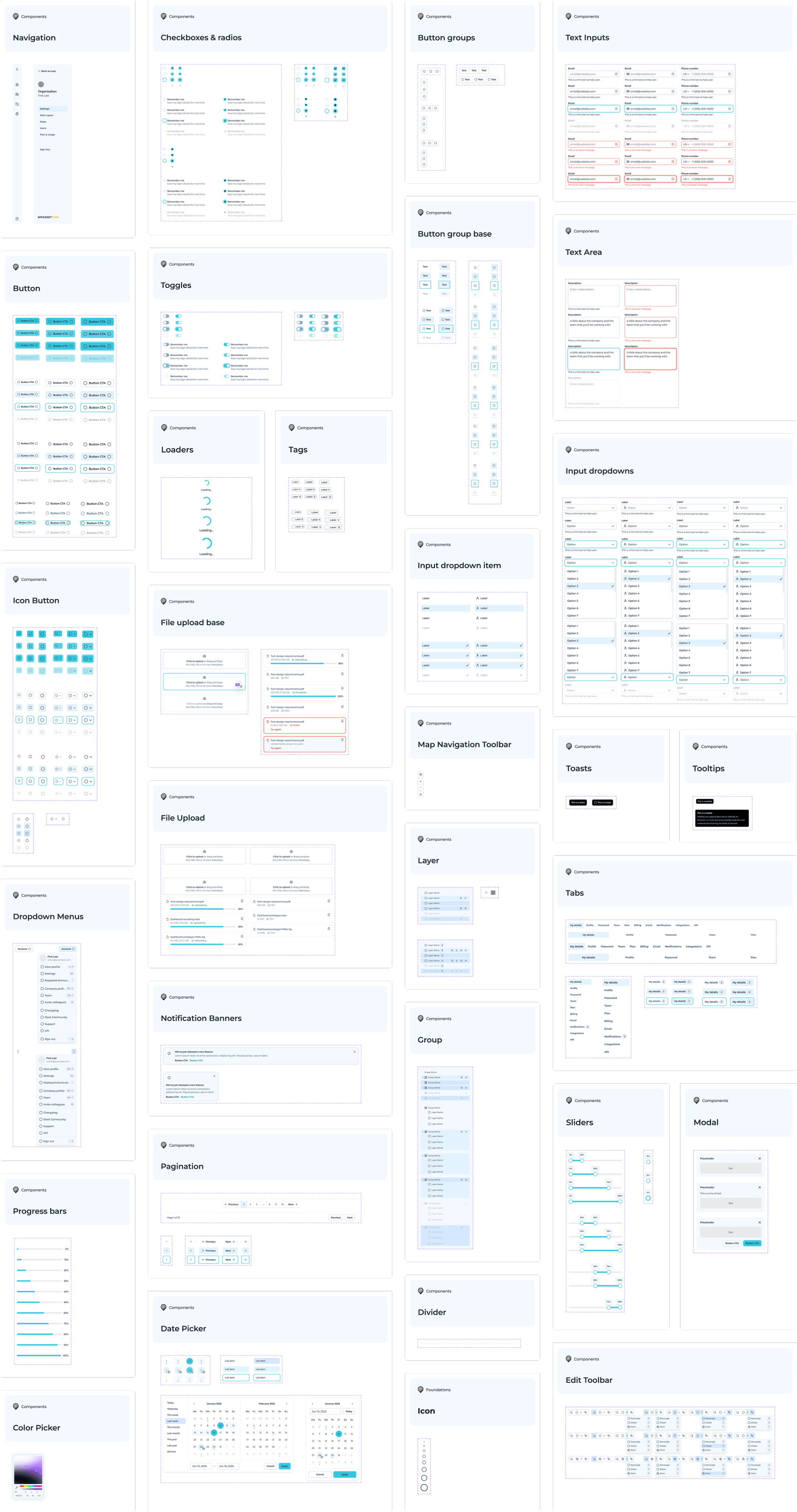
The product had no design foundation or shared components, and therefore no consistency.
Modal variants.
Button instances.
Unique floating panel components.
Reusable tokens.
Before redesigning any features, I built the foundation that would make everything else coherent and scalable. Starting from a base kit, I heavily modified and extended it to suit the specific needs of a GIS app.
I set up design tokens with full light and dark mode support, iconography, all base components, and a map-specific component layer.
The old flow was very convoluted and had different paths for different file types. Users had to know which button to click in order to upload an image and which one to click to upload a shapefile.
I simplified and clarified the flow, making it more intuitive and efficient. Users can now upload images and shapefiles with both an upload modal and by dragging and dropping on the map area.
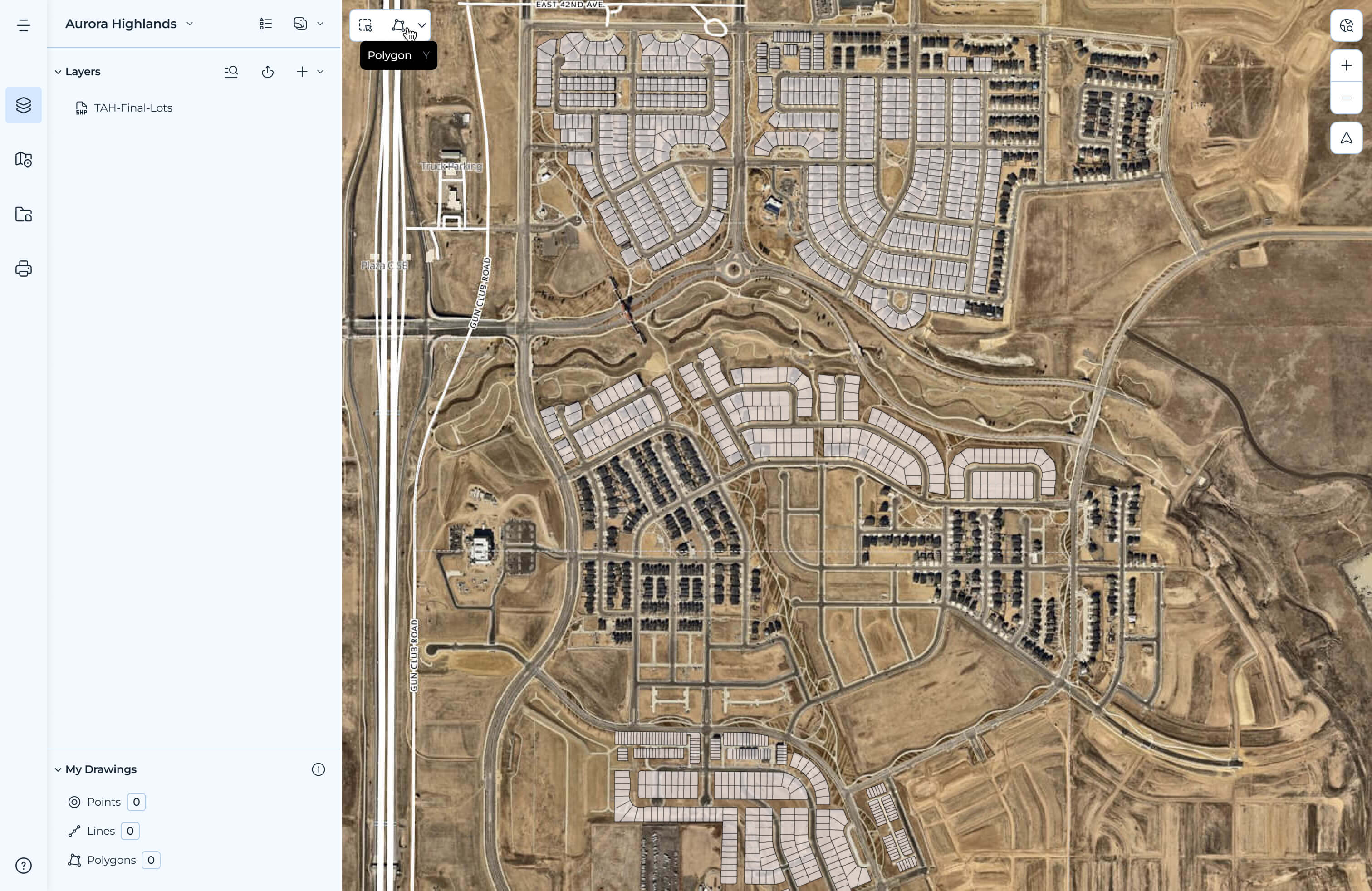
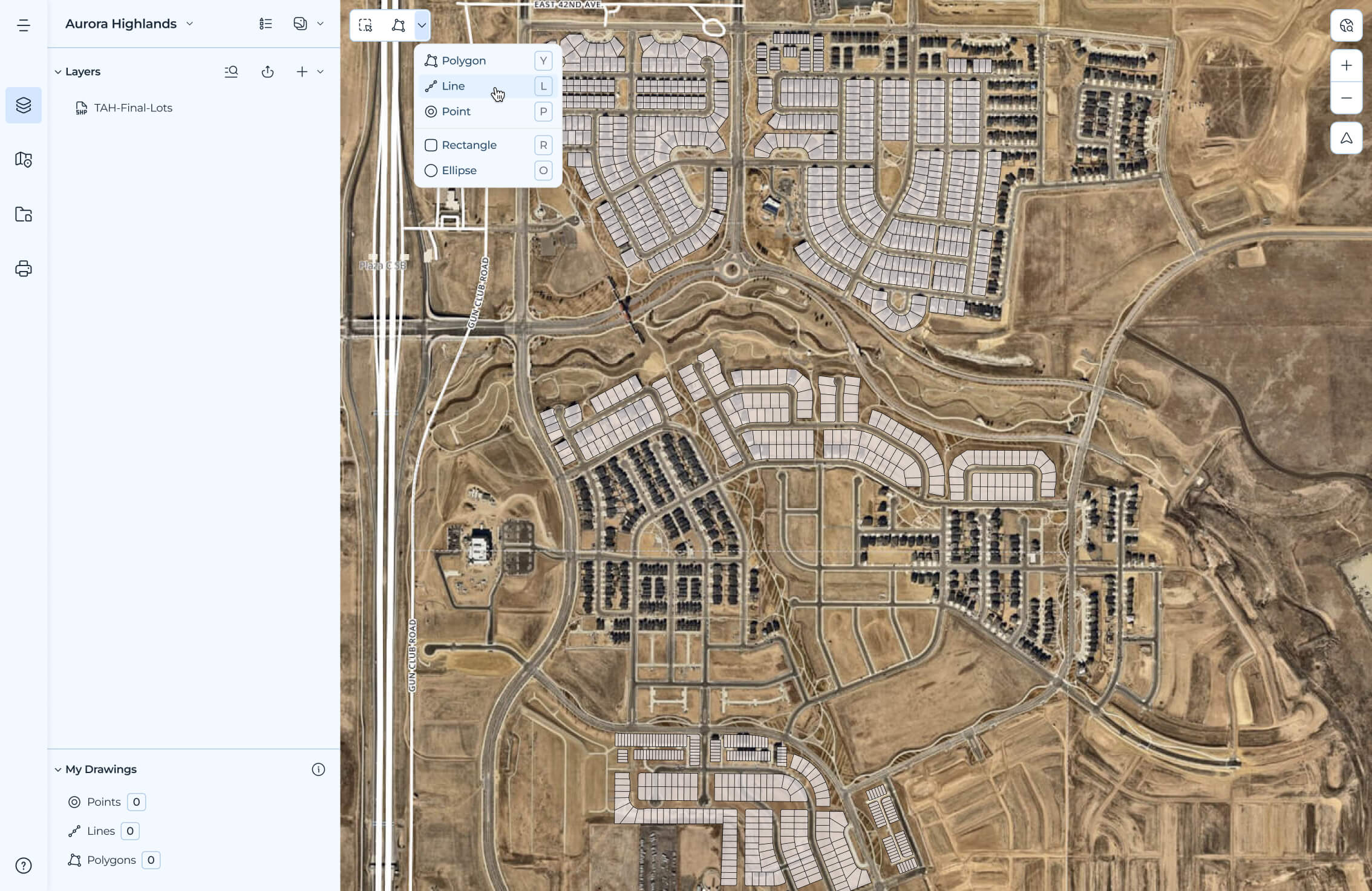
The existing tool had too many clicks, requiring users to first activate the tool, select a target layer with the correct geometry type, click to draw, click to save. No keyboard shortcuts, poor visual feedback, clunky and unintuitive.
With help from the engineering team, a nifty library called MapLibre, and a lot of research into how professionals actually use drawing feature in GIS tools, I redesigned the full drawing and editing experience, streamlining the interaction model, adding keyboard support, and making it all feel like a tool suited for professionals.
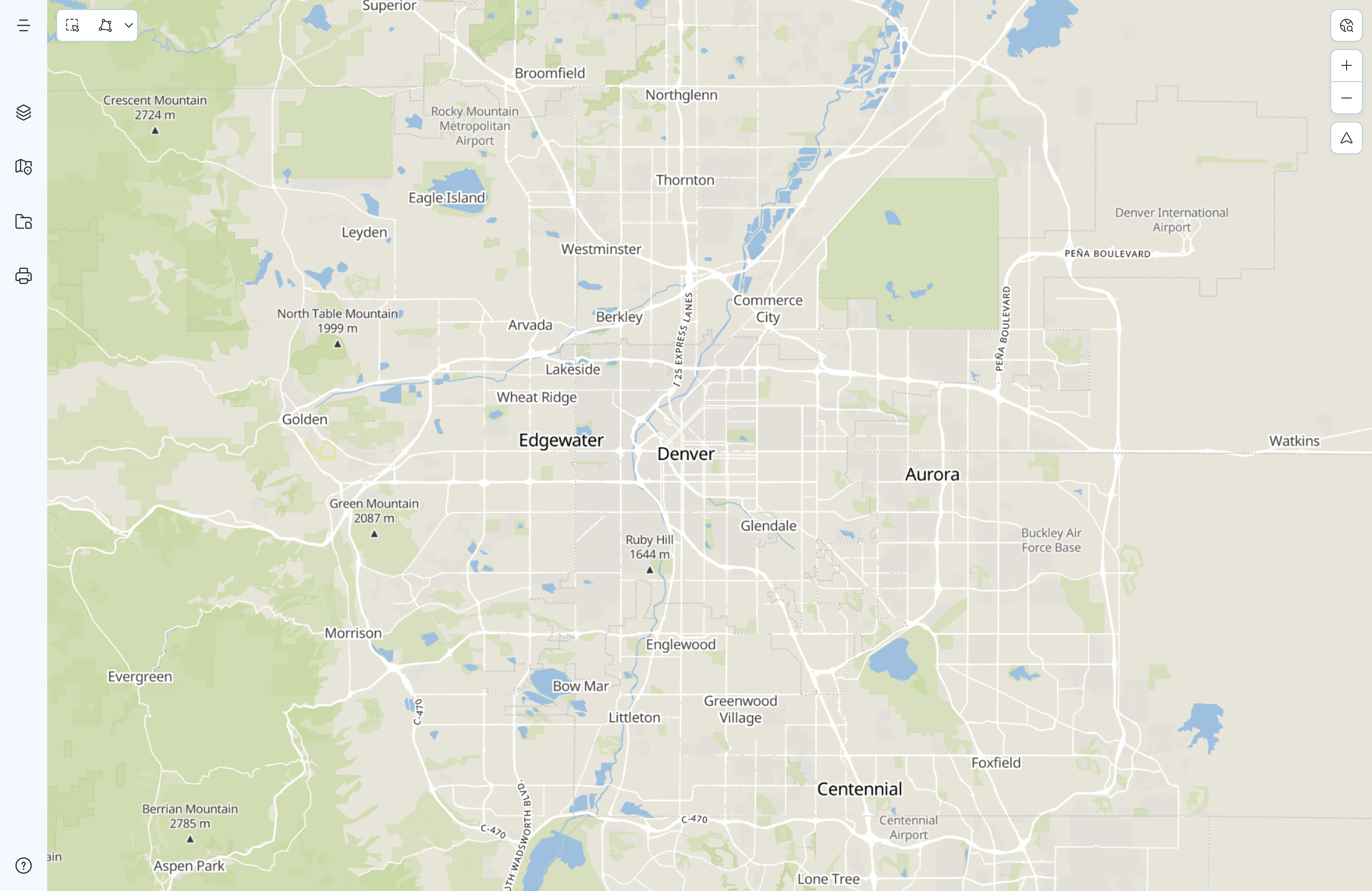
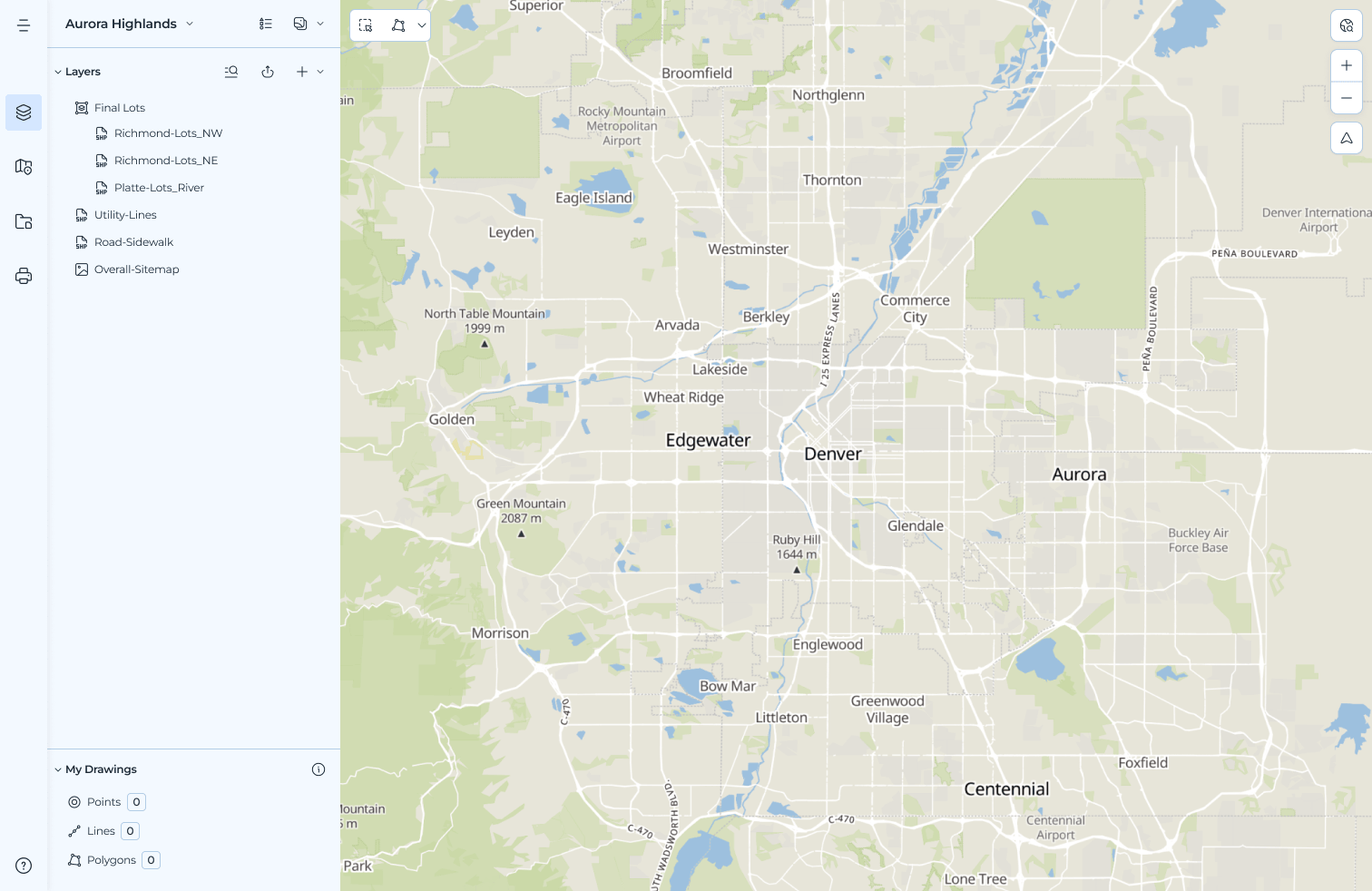
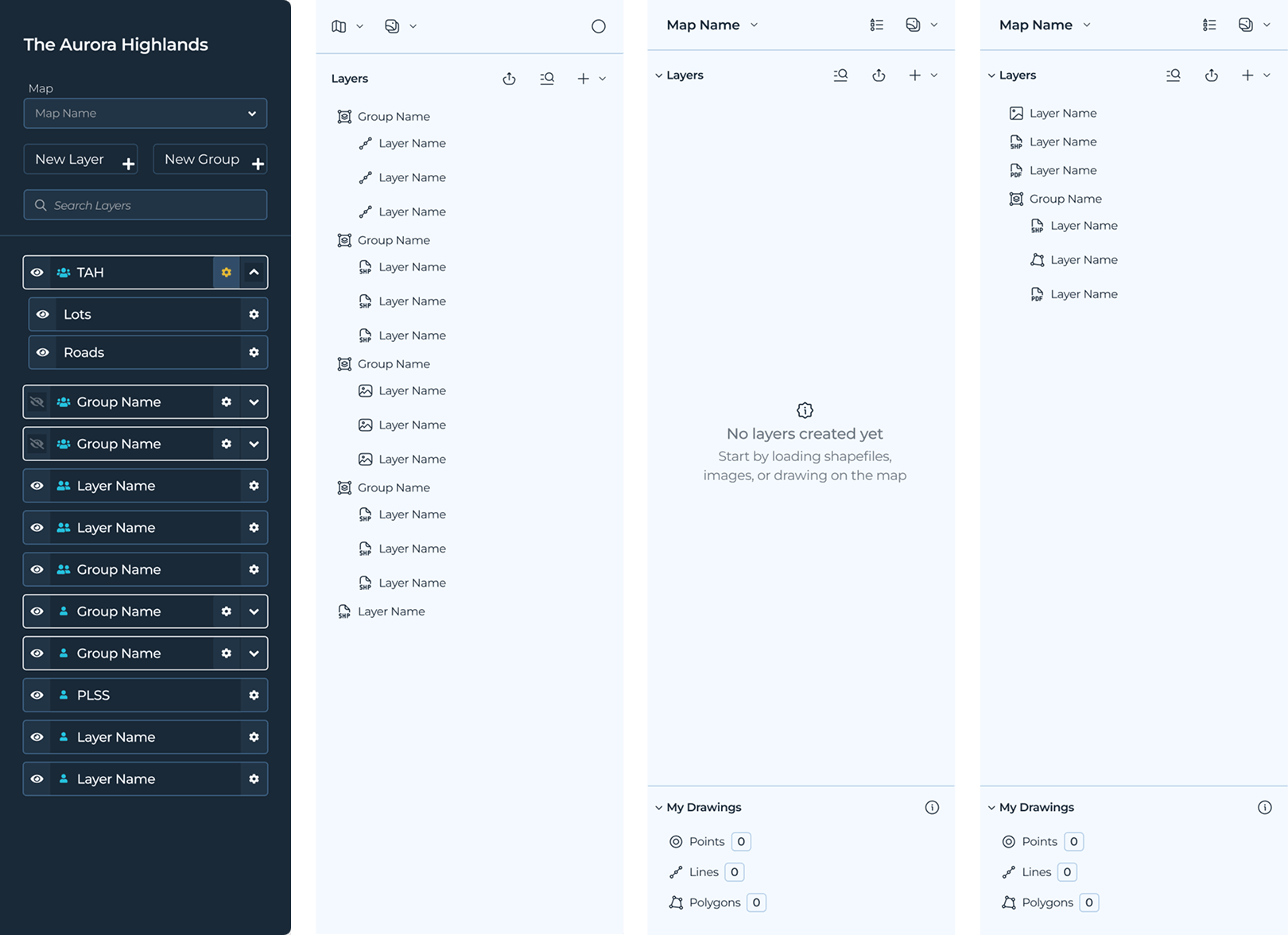
The old layers panel was a bit of a mess. It was cluttered, space inefficient, and hard to use. I redesigned it to be more readable, more intuitive, and more dense.
Redesigned with clearer hierarchy and controls, decluttered and more readable, with a system of icons to indicate and differentiate layer types, making it easier to navigate and understand.
We also reworked the group and layer components to support selected states, making it easier to see and understand the relationship between layers on the sidebar and the map.
This engagement required something different, as it wasn't about designing a new product. It was about creating order in an existing one which presents its own challenges and opportunities.
The 37 modal problem wasn't just a UI problem. It was a signal about how the product had been built and what it would take to fix it. The design system wasn't just a deliverable, it was a precondition for everything else.
The work is still in progress. That's the nature of design debt at this scale. But the foundation is there, and the product is much more coherent and usable.