ESTUS Digital

Redesigning our in-house project management tool.

Introduction

ESTUS Digital, a small startup, was seeking to improve the experience of their project and resource management application through a wholesale redesign. I was the first designer on the platform, responsible for everything from research to execution.

Year

2020–'21

Duration

18 Months

Role

UX Design
UI Design
Interaction Design

01

Overview

Problem

Much of the core functionality was lacking foundational elements of good UX. Additionally, proper product development processes needed to be implemented.

Users & Audience

Creative professionals including designers, content creators and software developers, in addition to project managers who required an expanded feature set.

Roles & Responsibilities

I did everything from research to UI and interaction design. I worked closely with the business owners and employees who were using the app on a daily basis.

Scope & Constraints

Other than a mandate to redesign the app and improve UX, the scope was somewhat undefined, which turned out to be a bit of a conundrum as the project unfolded.

Process

Discovery and Research

  • User interviews
  • Stakeholder workshops
  • Competitor analysis

Ideation and Design

  • Wireframing
  • User flows
  • Prototypes

Testing and Iteration

  • Development
  • Testing
  • User feedback
02

Discovery

To get a solid understanding of the problem, I conducted a workshop with stakeholders, then interviewed several users, getting a holistic view of business and user needs and pain-points.

It became clear that there were quite a few opportunities for improvement:

  • Unpleasant and overwhelming UI with visual bugs
  • Features that were extraneous for a majority of users
  • Incredibly slow loading times
  • Cumbersome time-tracking flow
  • Very little modularity or consistency — lacking design system
The before
03

Ideation & Wireframing

After conducting and synthesizing research, the next step was to start redesigning and refining core features through wireframing and feedback loops.

Dashboard

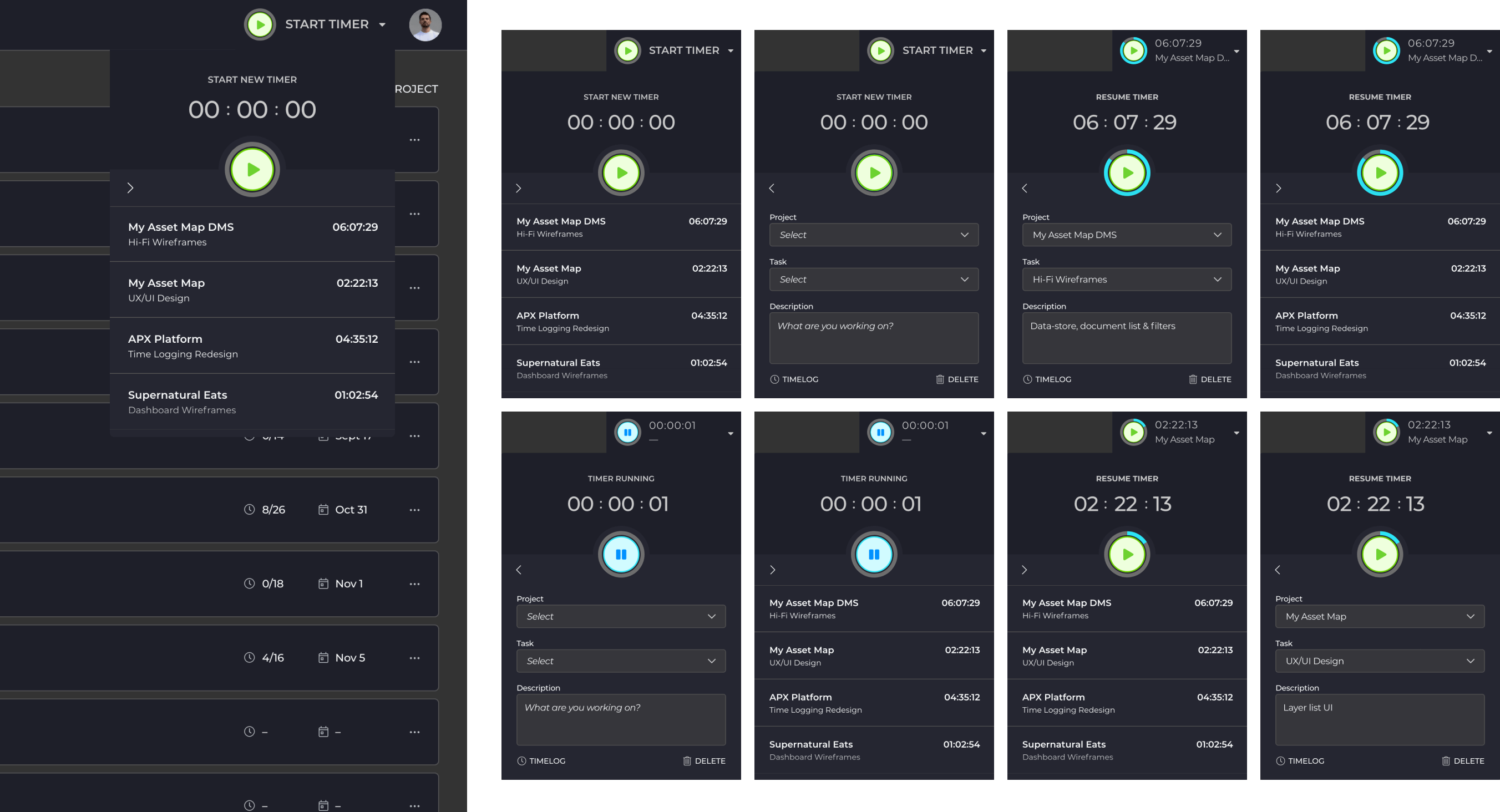
As the new home screen, users had a hub for pertinent information regarding their hours worked, schedule and current projects.

Variations of the main dashboard

Projects & Tasks Queue

Projects were re-organized in a list format with the ability to add tasks and subtasks, which could be assigned to any user(s) by PM's.

Projects in a list view, could have tasks and sub-tasks
Fly-out panel to gather details and access files

Time-Tracking

  • Time-tracking was a top pain-point for both the business and users. It was slow, unintuitive and frustrating.
  • Users had to context switch to enter time, or enter it all later on from memory. Each approach hindered productivity or accuracy.
  • By adding the timer feature in the top bar, users could start a timer and enter the details in the moment or later on.
Diagram to help explain timer interaction design

Time-Log

  • The time-log was redesigned to align with mental models of time. Entries were added on draggable daily timeline, and connected to a table, which brought flexibility, intuitiveness and even some enjoyment to an otherwise mundane process.
Different versions of the time-log screens
04

UI Design

From the implementation of a new design system, to a streamlined time-tracking experience, the whole platform was overhauled, given a facelift, and successfully wrestled out of design limbo.

Final dashboard, with time tracking metrics, events, current projects and users
Project and task queue. Projects and tasks are collapsible and expandable to customize view
Project details panel with tabs for summary, comments, activity & billing details (only available with manager permissions)
States of the timer widget
States of the time-log page, with empty state

Design System

A comprehensive design system introduced efficiencies in the product-development process
xx

Results

Overall the users and client felt much better about the re-design than they did about the original platform.

One of the key metrics of the business was tracking time on task against total time on shift. We were able to increase this percentage a significant amount, which was a big win.

Time Tracking Efficiency
80%   90%
10% Increase
Money Saved in Load Times
$1300/user/year

Learnings

  1. The old aphorism “you are not the user” actually wasn’t true here, as we were all using the platform daily. This allowed more bias into the equation and led to a tactical approach over a strategic one. Defining a clear roadmap and strategy is key, and pivots need strategy as well.
  2. Even with a direction and process defined up front, we kept falling back to a “fly by the seat of our pants” approach. For me, this reinforced how important it is to focus on a few core features before anything else.

More Work

UX/UI • Marketing Website
Republic Services
UX/UI • E-Commerce Website
SuperNatural Eats