Republic Services
As the second-largest provider of waste and recycling services in the US, Republic Services has a mission and responsibility to ensure that they are a leader in sustainable practices. As their agency, we were hired to craft an elevated experience that would build awareness around their sustainability goals and initiatives.
A small portion of our team including myself facilitated a discovery workshop with the clients where we gained an understanding of project goals, audience and discussed content at a high level.
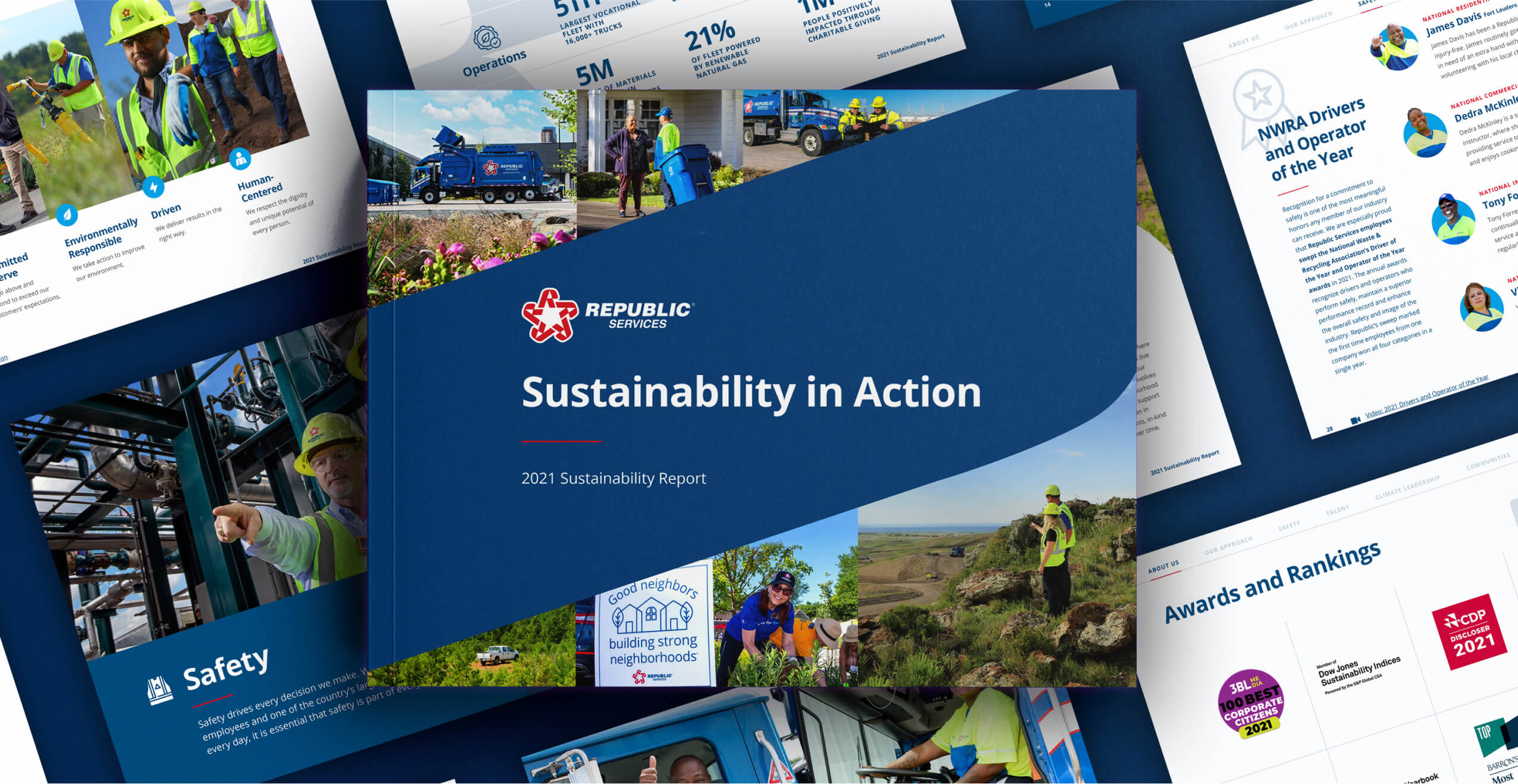
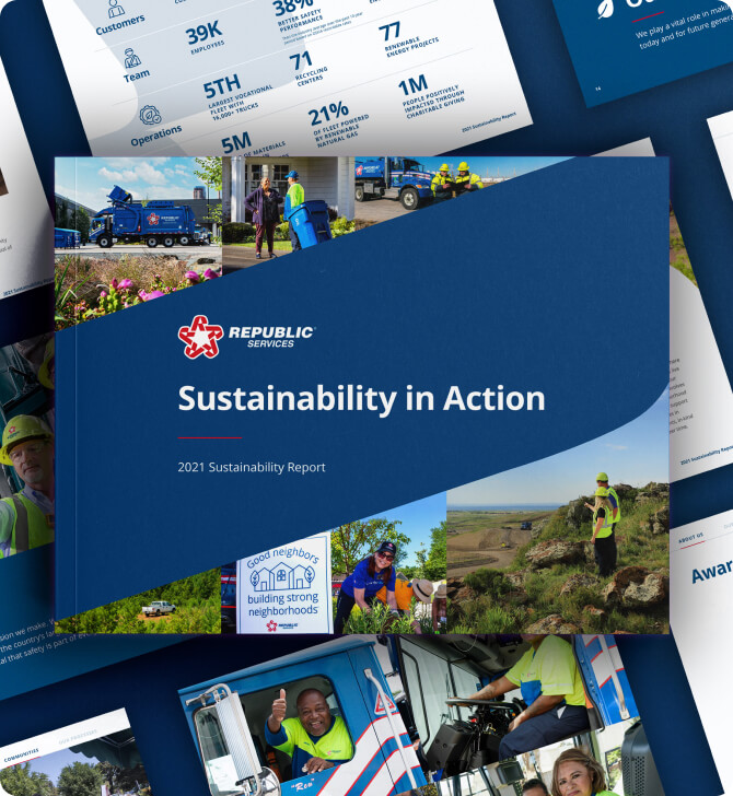
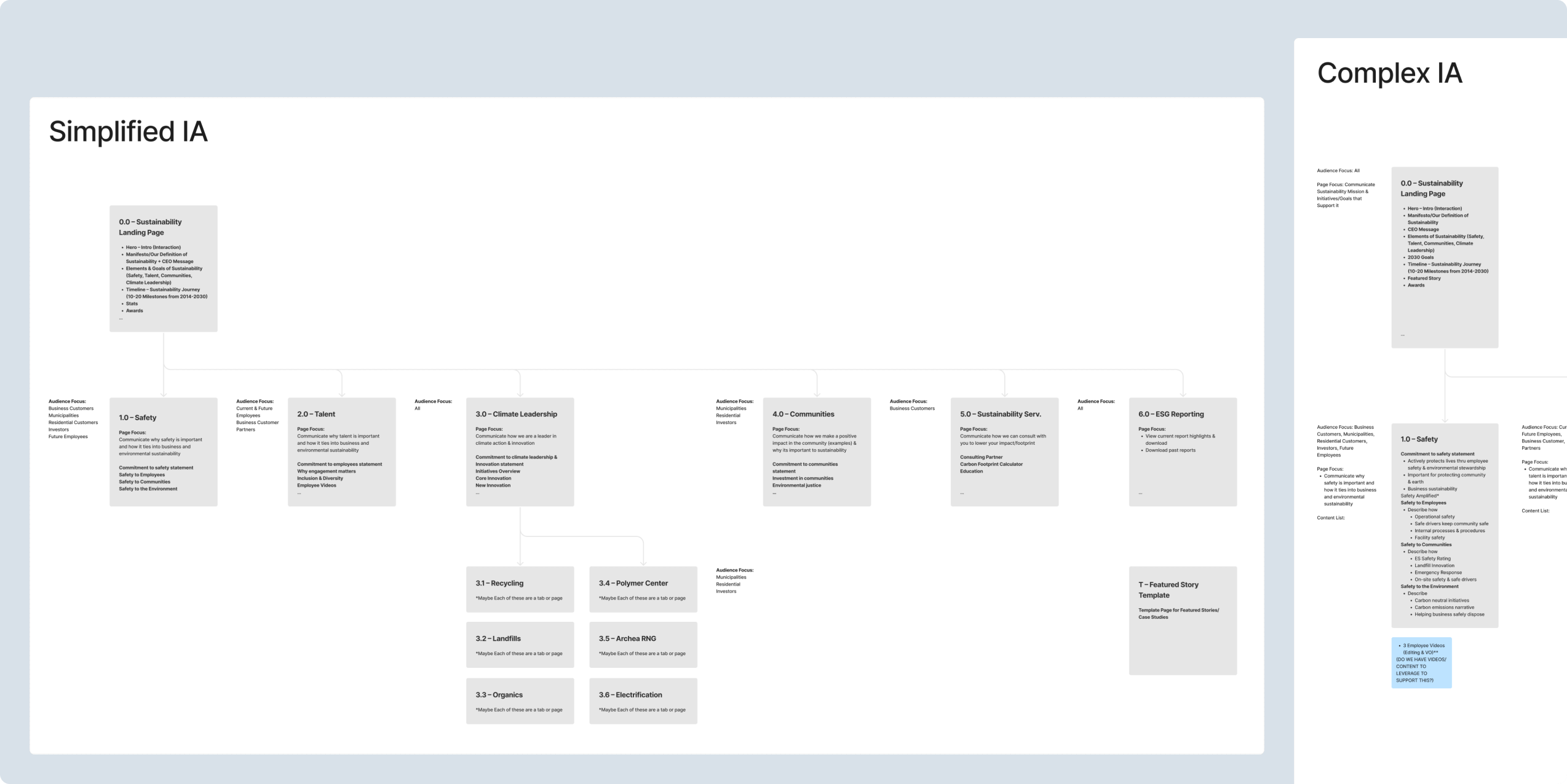
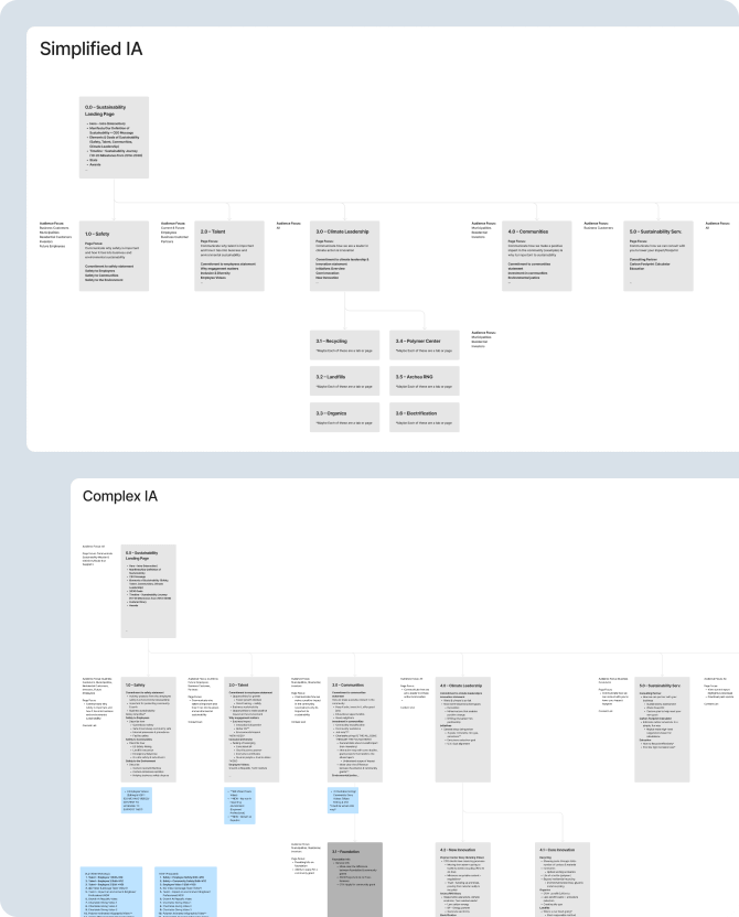
We looked at the past three annual sustainability reports, which gave us a general understanding of the existing content structure and messaging around sustainability. We felt it would be wise to not veer too far from existing structure.
After the workshop, the high-level structure of the site was somewhat straightforward to define, as we had our content categories and messaging objectives defined in the workshop. The harder part was determining the specific content to include or not include.
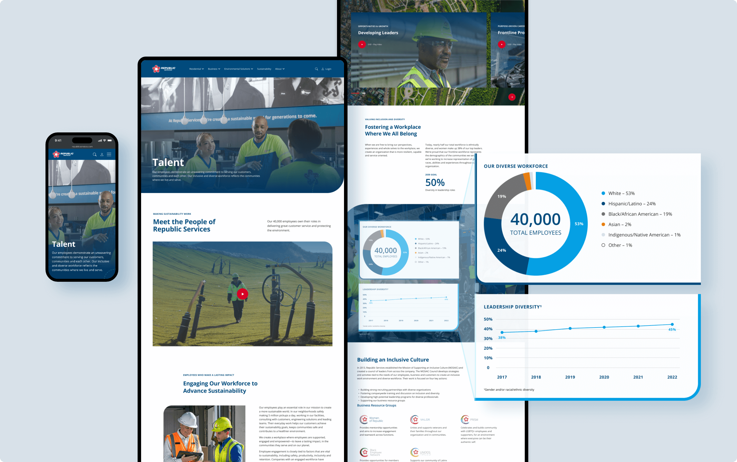
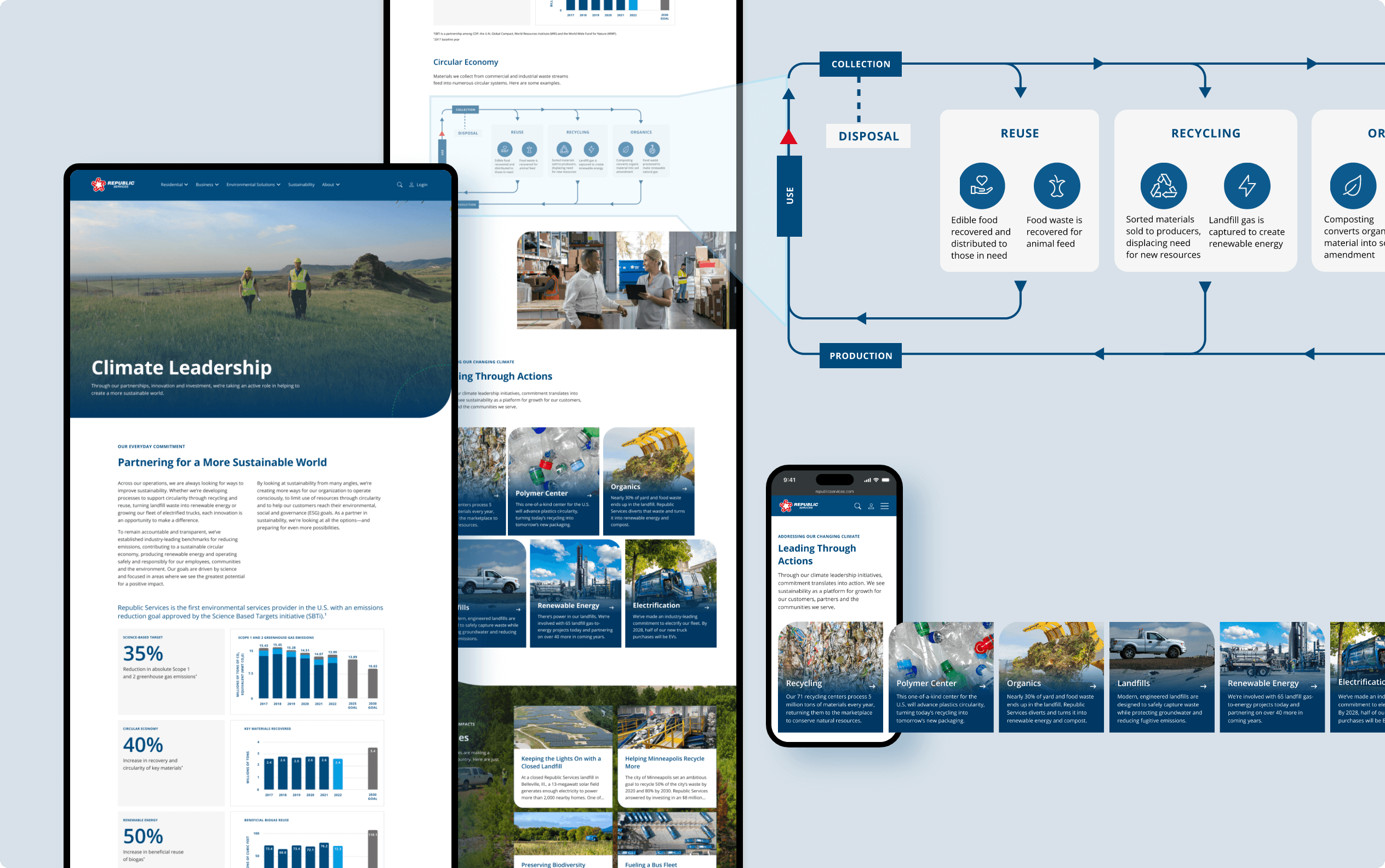
There were mountains of dense content to sort through, and much of it was in print format. To overcome this, I digitized printed sustainability reports, and categorized each and every page which helped inform a more detailed architecture, and allowed our geographically-distributed team to collaborate within a shared file.
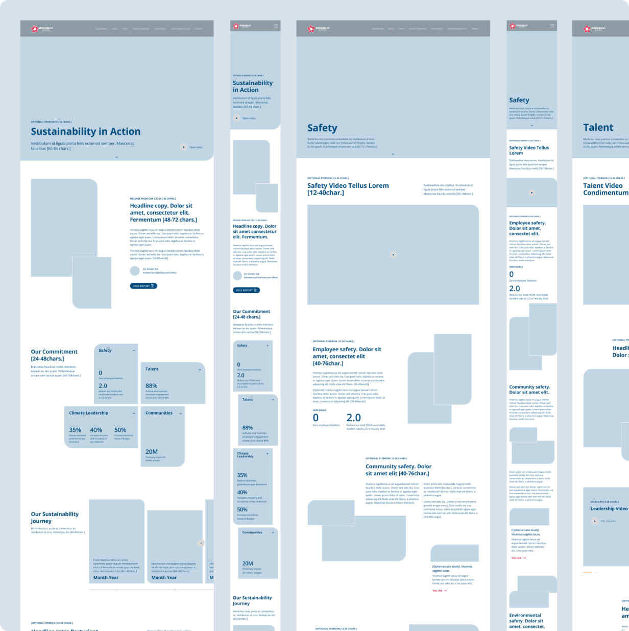
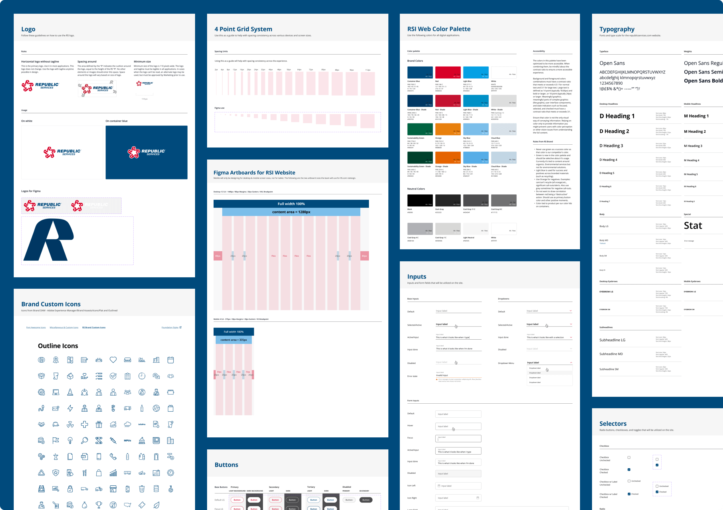
With our sitemap approved, I began ideation and wireframing. Part of this exercise was exploring different visual design elements and layouts because this section of the website needed to be "unique and elevated" from a design standpoint.
Typically, I would try and refrain from combining these two tasks, but our condensed timeline called for some compromises for the sake of time. I began to build a reusable component library that I hoped would build efficiencies for the later design stages, and create consistent patterns.
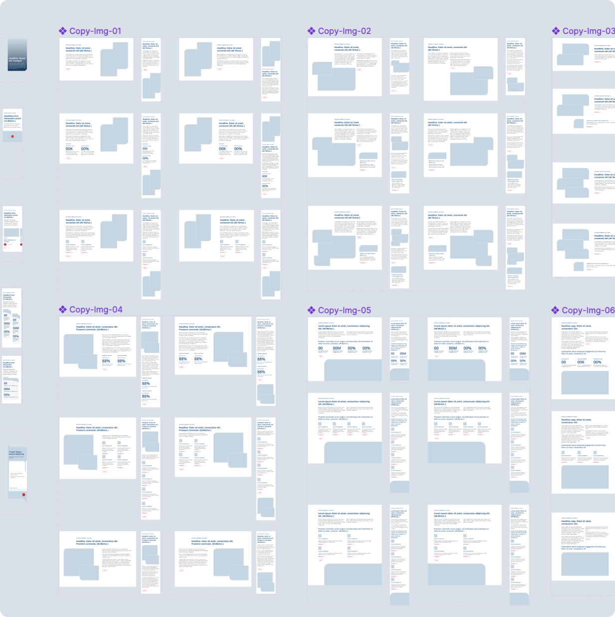
Ultimately, I needed to leverage many of the foundational pieces of the main design system, while creating bespoke, localized components to be used in the sustainability site.
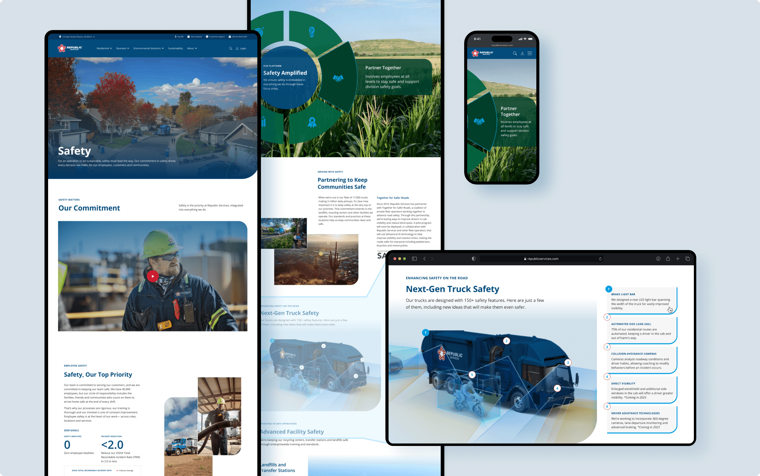
My goal was to create an open, flowing and immersive design that was enjoyable to look at and had plenty of white space so that content was not overwhelming.
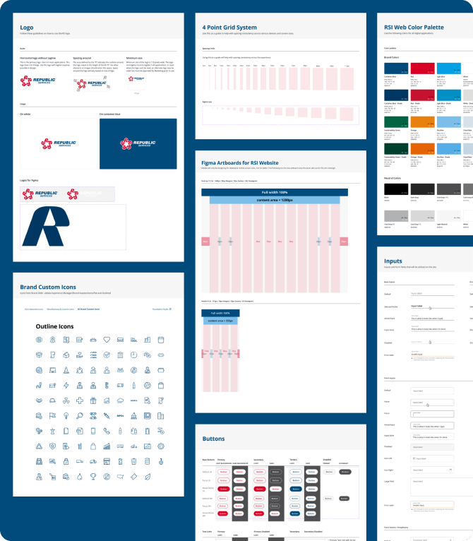
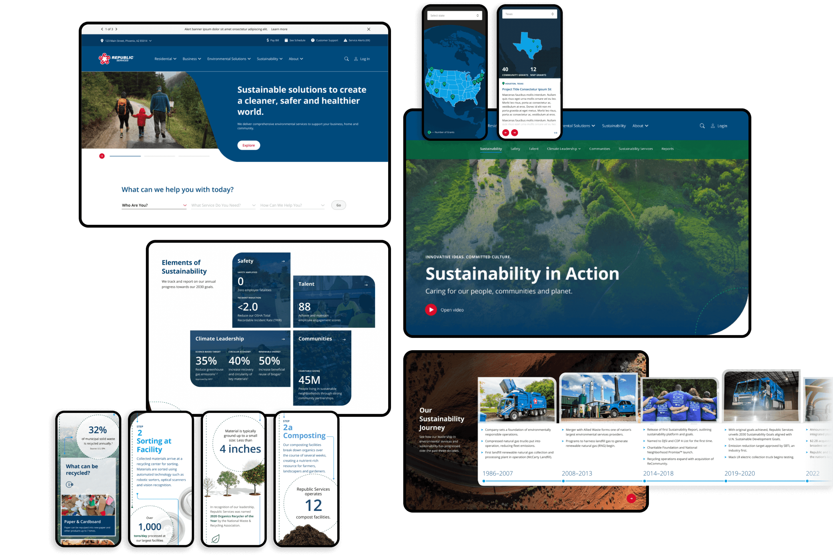
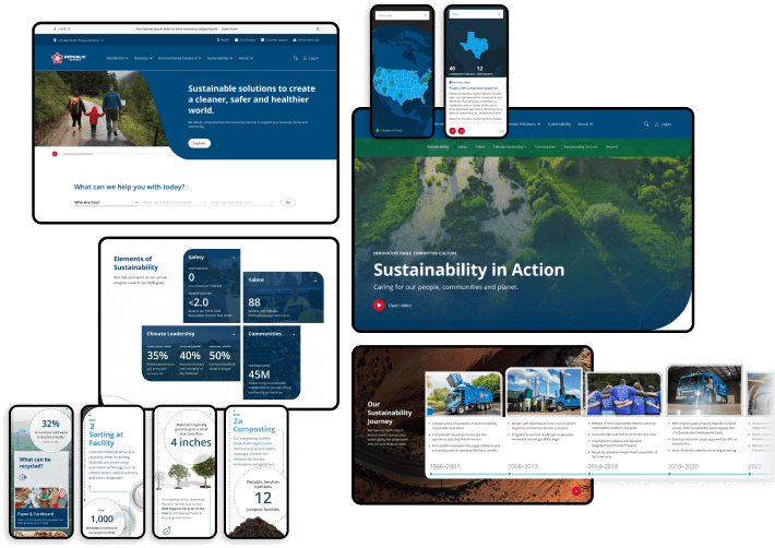
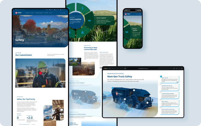
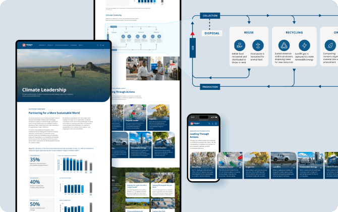
As the big introduction to the sustainability vision and goals, there was a need to incorporate unique and catchy elements on this page that would draw visitors in.

Beyond environmental sustainability, Republic needed to communicate their mission to steward a business built for longevity.

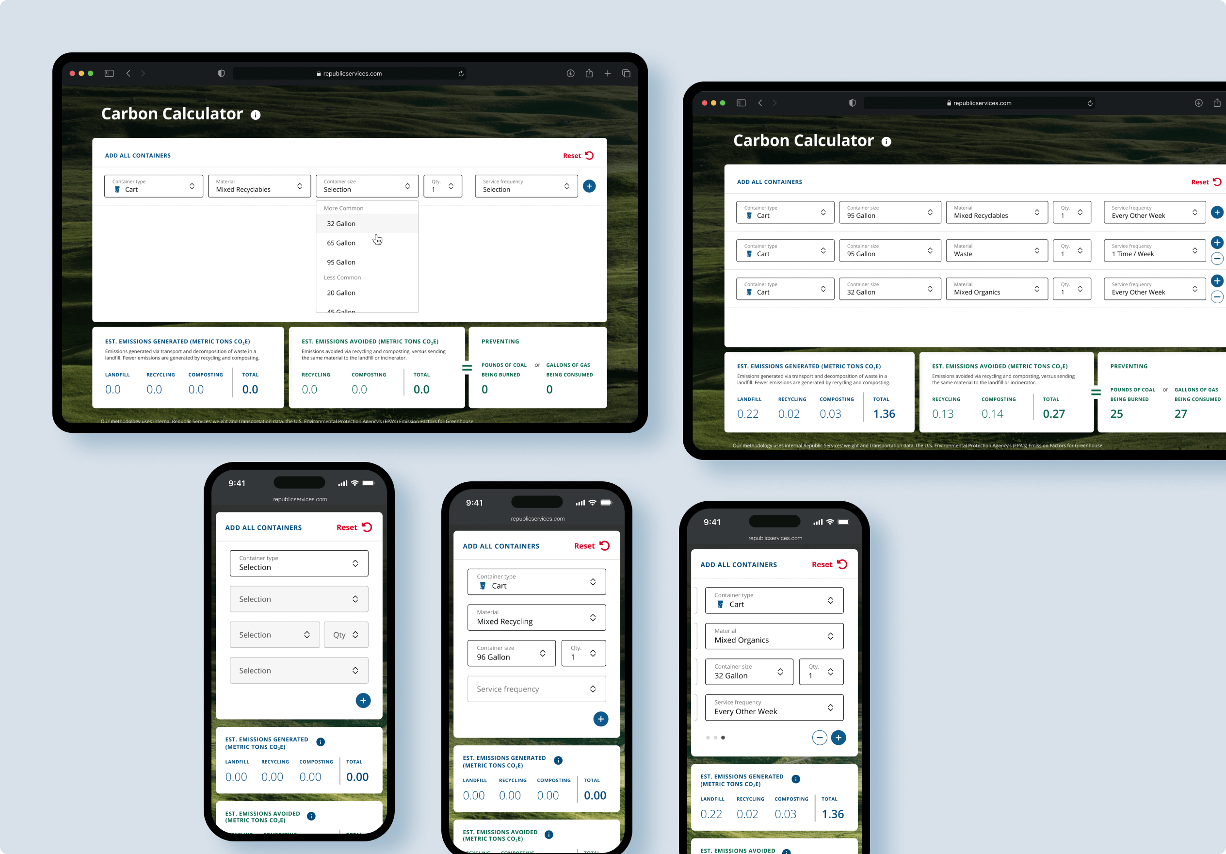
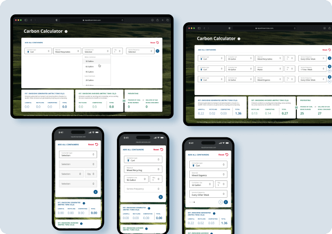
This interactive calculator calculates net carbon emissions generated by waste, recycling and composting.
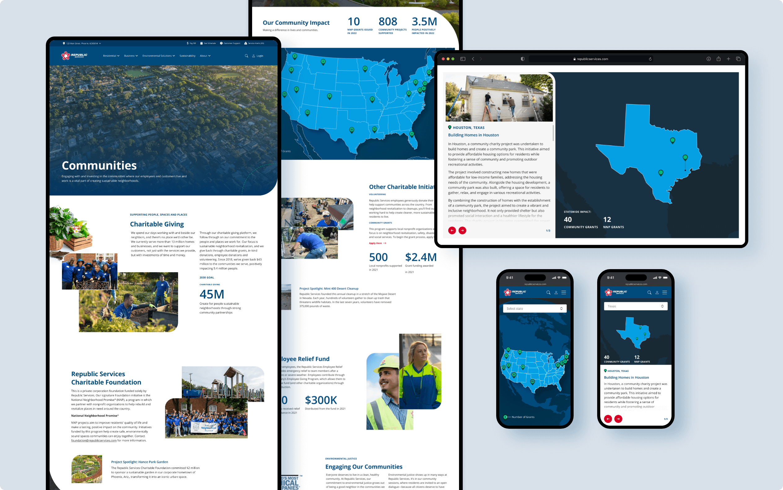
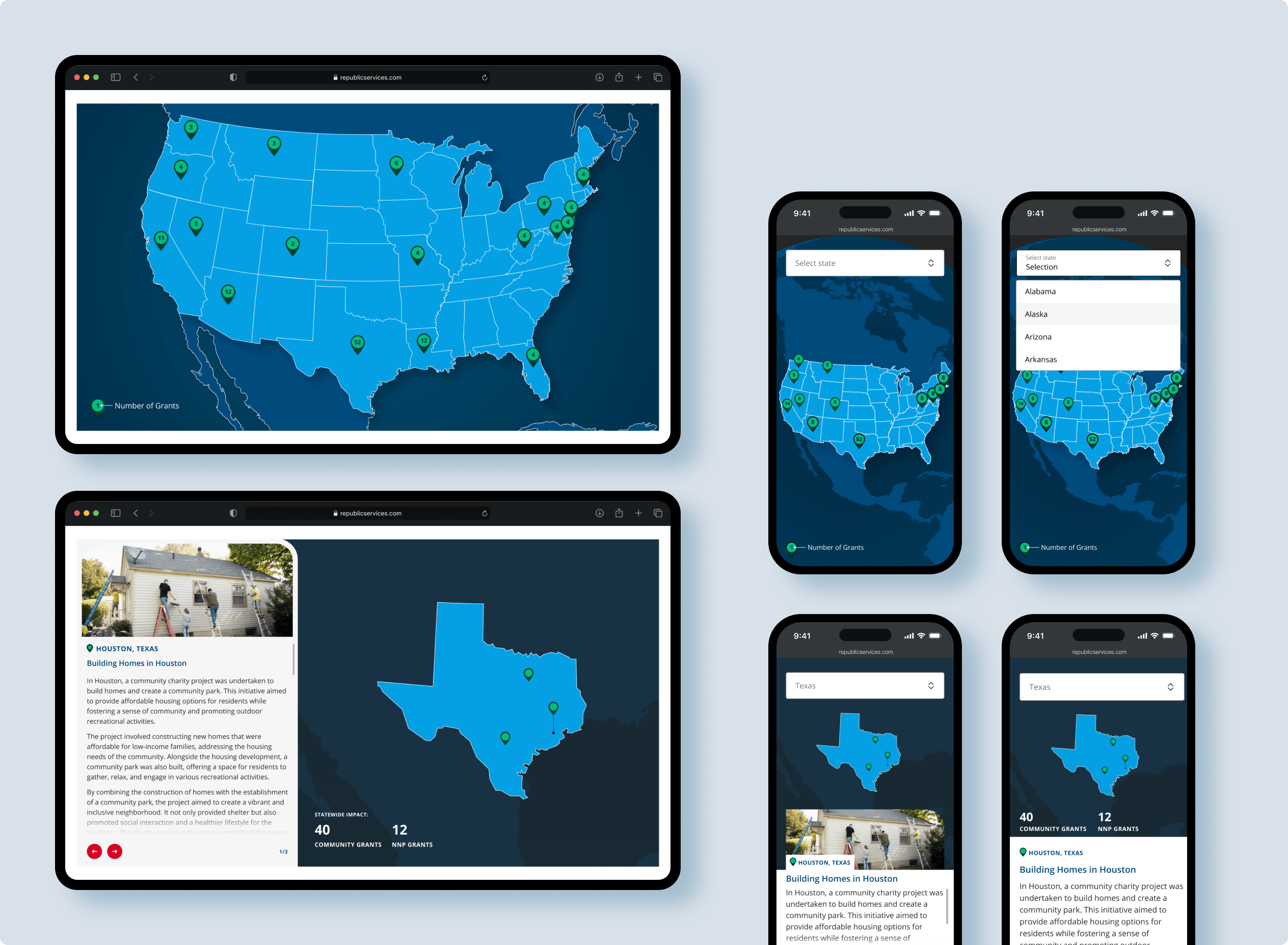
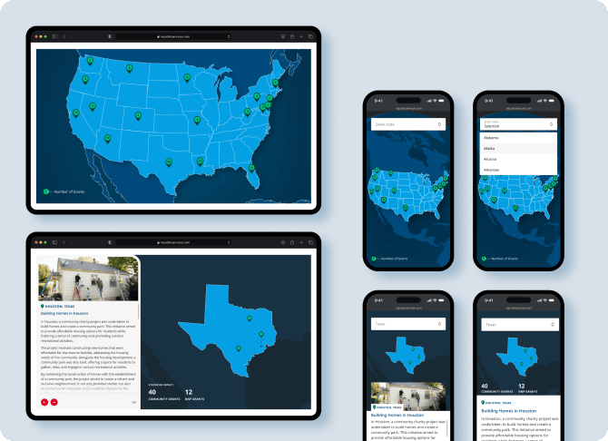
This interactive map displays all of the community building and charity projects backed by Republic, communicating their positive impact on the communities they serve.
Because the client wanted to elevate the experience and make it come to life, it was important to really nail the micro-animations.
I started by building a dupe of many of the sections in Webflow, prototyping many of the animations to get them just right. I then pulled all the specs, captured videos, and organized it all on a shared Notion site to pass to developers. They were very happy that everything was so detailed.